


It’s been quite some time since Google rolled out the Android L Developer Preview for Nexus 5 and Nexus 7. We decided to boot it up and experience what’s inside. The device used is a Nexus 7 2013 (Wi-Fi).

The first dramatic differences when you boot up Android L are obvious. There is a complete UI overhaul compared to the previous iterations of Android and Google has ditched the Holo theme for the Material design, which is itself a welcome change.

The changes are noticeable from the very beginning, considering the button layout to be exact. We now have 3 buttons at the bottom of the device, a triangle to go back, a circle that would take you to the home screen and a square to reveal the running apps or the multitasking window.

The lock screen has got a complete overhaul and it now has the capability to host your notifications, with which you can interact as well. The ability to add widgets on lock screen is gone and swiping up unlocks the screen while swiping left takes you directly to the camera app.
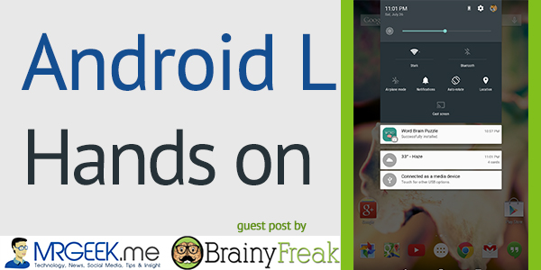
The famous Android drop down menu has got a visual treatment as well. Swiping once reveals the interactive notification cards, whilst swiping again reveals a host of device toggle buttons and management options. This was previously done by swiping on either side of the tablet screen.

Swiping from the top left revealed the notification drop down menu while swiping from the top right revealed devices toggle options. However, gone here is the clear all button for the notification cards and instead one would have to clear them out manually.
The Multitasking window is also redesigned. We now have apps taking form of cards piled up and can be revealed by swiping up or down. Swiping left, right or clicking the cross icon closes the apps. The settings menu has also changed completely compared to the previous versions.

But that’s not all of course. There are other little things that definitely change the feel of Android, most notably, the new animations. Animations around the whole system have been redesigned and the interface now feels more flat and smoother.
It feels like everything makes a sense of where it is coming from and where it’s going to, and apps are definitely going to take advantage of the new way of interaction. Since handling animations can be a tricky job, Google has ensured that everything runs a 60 FPS for a smooth, clutter free experience.

Along with the Android L, has come a new way of runtime for apps, that is the ART (Android Runtime), coming up from Dalvik, which was previously used since the launch of Android. Although the ART was seen before in Android KitKat, but it’s more solid here.
Many of you might not know what we are talking about here, but let’s just make it simple, ART is a custom designed Google’s runtime which is better than Dalvik in many ways and to the end user it benefits them with better device performance and quicker install and load times for the apps.
Talking about this Developer Preview as a whole package, well, this is just a chance by Google to the developers to have an experience of how radical the changes are with this new update when it is released later this year, and in fact it’s not really the daily driver material you might expect.
Most of the apps from the Play Store are compatible but bugs are there which need to be addressed as the full consumer version is released. Overall, it’s really fun to play with this new OS and the way Android feels and behave is just beautiful.
In fact it’s a more solid experience than before, thanks to the Google’s new approach to flattening the design which is radically going to transform the experience in the coming time.
About Nooh Kazi
Nooh Kazi is a Android Analyst and a Writer at brainyfreak.com, he keeps an active eye on the latest happening in the tech world and a guest writer at mrgeek.me, like his page by clicking here.