


I have decided to publish the contents of my Complex Networks and Web coursework project here on Mr. Geek. The information contained in this post might be complex to some, but I assure you that this will be a good long read. I have included lots of pictures to make sure you don’t get bored in the swathes of text.
Also, there’s an awesome interactive data visualization that I have created in Sigma.js for you to play with. Check it out later, as you need to read my research to make sense of it. I obtained the joint highest marks for this project in the class, so I am happy to say, even my professor believes this is a fine piece of work. I believe too. It indeed took some time, thought and lots of work, but the end result is satisfying.
I don’t like keeping interesting things to myself, and I believe in sharing all my knowledge. That’s why I build Mr. Geek, a home where I could share my work. I would appreciate if you could reference my work when you have to. Also, I’d like to thank Paolo Negrini from University of Oxford who gave me interesting pointers.
1. Introduction (Abstract)
Question: How can we measure influence in a group using social network analysis?
This project aims to study the relationships (edges) between a large number of people, identified as influencees and influencers (nodes). An original dataset will be collected from semantic encyclopedic resource(s) for analysis. The dataset is expected to boast ~25,000 edges with ~14000 nodes. This dataset will be parsed using Java into the correct format required for data visualization in Gephi.
The analysis will consist of computations on the directed graph dataset such as network centrality and degree distribution measurements to understand influence in this particular social network sample at hand. Furthermore, the study will also address the question “shouldn’t influencing someone influential count more“, which aims to be answered via PageRank style analysis.
This is just the gist of what will be accomplished. Further interesting conclusions could possibly include identification of clusters of sub-groups having similar interests, movement of ideas and much more. The ultimate goal is to demonstrate how a chunk of data can reveal insight about people’s relationships, and this project aims to fulfill that goal using key properties of network theory.
Background
The nature of this project demanded data collection through encyclopedic resources, as mentioned in the abstract. At the present moment, a live extraction framework known as DBPEDIA has extracted data from Wikipedia info-boxes and organized the data into a more semantic, graph based structure, known as RDF.
It is beyond the scope of this project to discuss what RDF is, but it is fair to say that it’s the foundation for what will be known as Web 3.0, or as Tim Berners Lee calls it, the semantic web of linked data. Now, to collect the data about the relationship between influencees and influencers requires the use a query language called SPARQL.
The simplicity of the query language and the output returned is a key reason why DBPEDIA was chosen as the source of data, instead of Freebase, which outputs in a JSON format, a harder choice to parse. The image below shows the data available in a Wikipedia Info-box for the Mathematician Pythagoras, showing the respective people he influenced and was influenced by. During our study, we will refer to people influenced by the influencers as influencees.

- Fig. 1
This information could be easily represented on a graph as nodes and edges. In the sample below, Pythagoras has 1 in-degree and 1 out-degree. The tabular information resulted from the SPARQL query can then be parsed using the Java programming language to create a GDF (Gephi Data Format) for visualization.

- Fig. 2
To discuss more about this small diagram on left, we can deduce that Pythagoras influenced Euclid whereas Pythagoras was himself influenced by Thales. Since our data will be a directed graph, the rows towards a degree can also be regarded as a follower. Hence, a node’s in-degree clearly represents a follower, or an influencee.
SPARQL
A sophisticated SPARQL query has been crafted to retrieve data from Wikipedia info-boxes and any other data that DBPEDIA has extracted and added into its dataset in the form of an influencedBy and influenced vocabulary. The DBPEDIA framework uses these two terms in bold to access the data we are looking for, as it is a standard vocabulary used for consistency purposes.
DBPEDIA has a large ontology for a retrieving a lot of information in a set structure, but we are not looking beyond at the present stage. For statistical purposes, DBPEDIA is said to include at least 364,000 persons [1], which turns out to be quite the data. To come to the point, the only SPARQL query used to access the data is shown below. It uses the RDF format for querying due to the DBPEDIA schema.
select distinct (str(?rLabel) as ?influencerName) (str(?eLabel) as ?influenceeName) where {
{ ?influencer a dbpedia-owl:Person . ?influencee a dbpedia-owl:Person .
?influencer dbpedia-owl:influenced ?influencee .
?influencer rdfs:label ?rLabel . filter( langMatches(lang(?rLabel),"en") )
?influencee rdfs:label ?eLabel .filter( langMatches(lang(?eLabel),"en") )</pre>
<pre>} UNION
{ ?influencee a dbpedia-owl:Person . ?influencer a dbpedia-owl:Person .
?influencee dbpedia-owl:influencedBy ?influencer .
?influencee rdfs:label ?eLabel . filter( langMatches(lang(?eLabel),"en") )
?influencer rdfs:label ?rLabel .filter( langMatches(lang(?rLabel),"en") )
}
}
The result in the table as shown below is the sample output of the query entered into the SPARQL-DBPEDIA endpoint (http://dbpedia.org/sparql). Of course, it’s not just 5 rows but around approximately 26000 rows, which are essentially the edges. To clean up the data, we need to fix Unicode issues and remove any commas within the individual nodes (or names of the people) to ensure there are no parsing errors.

- Fig. 3
The .CSV generated for the data by the query editor does not fix Unicode issues and garbles up some node names of people for e.g. Héctor gets converted into un-readable ASCII as Excel doesn’t support Unicode contained in a .CSV format. To fix this, the data is copied into Excel directly without associating any format like .csv.
After copying the data from ‘SPARQL browser output’ directly to Excel, the Unicode issues seem to have been fixed. It is important to honor people with non-English letters, by displaying their name correctly in the dataset. So for instance, after the workaround, the name of this person becomes cleaner.
Attila JÌ_zsef (pre clean up) | Attila József (post clean up)
Even though the Java parser written (to be discussed below) will have no problem parsing whatever is given, it is considered a good practice to ensure the truth in the knowledge by providing as much accuracy as possible for the study. Since some of the ASCII text shows up garbled up, it becomes hard to identify the people names.
The Workflow
Since the goal is to create a GDF (Gephi Data Format) for visualization from the current dataset, it is important to prepare the data for parsing in Java. Here’s a diagram to simplify what’s happening.

Fig. 4
Java Parser

Fig. 5
As mentioned earlier, before creating rawnodes.txt and rawedges.txt files, it is important to use Excel’s Find and Replace All function to replace any names with commas. This is because commas are only supposed to be used to separate two nodes in an edge, and any extra comma inside a name could damage the parsing process in Java. It was trivial to achieve this with Excel’s built-in functionality.

Fig. 6
Once the rawnodes.txt file is created, it contains all the names from the dataset collated on top of each other from both the Excel columns (influenceName and influenceeName). Secondly, to mesh the two columns to represent each edge by comma separation, an Excel formula will be used. The final result is expected to be as shown in Fig. 6. The formula is precisely: =trim(A1&”,”&B1). This Excel feature is used to help create rawedges.txt. (copy pasting: Excel > text-editor).

Fig. 7
Now, the Java parser utilizes these two files, namely rawedges.txt and rawnodes.txt to create a new file called newnodes.txt with the Node IDs. This is achieved with a file called NodeCreator.java. A HashSet<String> interface in Java is used to remove the duplicates present earlier. Now, this newnodes.txt file is used to create the edges (with a node_id, node_id format), using a file called EdgeCreator.java, and the output is directly copied from Eclipse into the Sublime Text 2 for creating the .gdf Gephi file (Fig. 4), which is trivial. The code is provided in the zip package, but here’s a screenshot anyway. The total number of nodes is 13814 with around 25189 edges, which is a recipe for quite a complex Graph, as we will see.
Final Stage for Data Preparation
Now, as each node has its own unique ID (like id, name) and the edges are represented as IDs, separated by commas, it is now possible compile this into the Gephi format (.gdf). The content from the newnodes.txt is simply pasted below this line of text, which defines the nodes with their names. This is pretty self-explanatory.
nodedef>name VARCHAR,label VARCHAR
Nodes go here like 1, Ali Gajani
Furthermore, to add edges, the following line of text is added below the last node line, and then the content for the mapped edges (i.e. node1, node2) is pasted further below. There is no sort of gaps between any of the lines, as everything is a continuation sequence. Gephi understands the data automatically.
edgedef>node1 VARCHAR,node2 VARCHAR
Edges go here
3. Results (Visualization and Analysis)

Fig. 8
Once we have the data loaded in Gephi, we are ready for studying the directed graph; it’s structure, properties and many interesting elements from a network science perspective. At first, a few interesting statistics about the graph is its sheer size, which is 13k nodes and 25 edges. With the current setup, the computer fails to process such a vast amount of data effectively, so it becomes obvious to reduce this noise by filtering processes.
Degree Distribution

Fig. 9
Before delving deeper into our study, there are some interesting properties that must be discussed from a statistical standpoint. At first, we will look at the degree distribution of our graph, which reveals some interesting things about this social network. If you look on the right, the degree distribution is a power law. The average degree of any node in our graph is 1.823.
The power law distribution in the graph exhibits how very less people have a very high degree, which clearly is seen in a social influence network of any kind. This is observed by looking at the scattered node data points on the right hand side of the graph, also known as long tail. In simpler words, the network is dominated or influenced by a very specific number of people as measured by their degrees, (in-degrees+ out-degrees), or connectivity.

Fig. 10
In some cases, one might argue that a degree distribution alone is not a good indicator of the distribution of influencing bodies in a social network. To answer this, an in-degree distribution chart has been created to showcase why the graph still exhibits a power law again. The in-degree distribution is a more clear-cut indicator of authority, as in-degree equals influence!

Fig. 11
The sample chart shows top 10 most influential people in our dataset ordered in descending form by the number of in-degree’s or influencees/followers they possess. An in-degree is a good indicator of authority but we will look at more interesting influence measuring techniques later in the study as we go on.
Average Clustering Coefficient
For our graph, we are interested in the Average Clustering Coefficient, which could reveal the average of all the clustering coefficients of each node. The average clustering coefficient is a decent indicator of the connectivity within a network. The calculations in Gephi reveal that the average clustering coefficient for our directed graph is 0.032 which is very low, but understandably obvious to due reasons. This low average clustering coefficient indicates the weakness in connectivity amongst the entire graph due to two reasons. Firstly, the people in our social influence graph lived different eras in history. Secondly, more connectivity exists between groups of specific areas, or professions, and this overall, results in a lower value as shown.
Betweenness Centrality

Fig. 12
The betweenness centrality is the measurement of node’s centrality in a network, or simply, how effectively does a node act as a bridge. This is another measure of a node’s influence and importance in a network. The chart on the left showcases a power-law distribution, but the values are so closely knit that it becomes very hard to see the details.

Fig. 13
To enlighten ourselves more about this with some concrete names, we have presented a table with the people boasting the highest betweenness centrality. As you will see, there are multiple names in this list that existed in our in-degree distribution table (Fig. 11) as well, like Nietzsche, Kant, Marx and Hegel, all philosophers and featuring as very influential men in our dataset. We will reflect upon this with a visual proof.

Fig. 14
The image on the left is a snapshot of a small portion of our graph. The blue node is Jean-Paul Sartre, featuring as the person with the highest betweenness centrality. Sartre acts as a bridge, between German Philosophy (bottom nodes) and French Philosophy (upper nodes), causing a movement of ideas. Although Sartre does not boast a high in-degree per say, his betweenness centrality can reveal how influence can transpire across lands, through specific people, as him – interesting data discovery!
Closeness Centrality

Fig. 15

Fig. 16
The two figures above showcase the data and visualization of the closeness centrality of the nodes in our graph. At first sight, the chart on left shows the distribution of the closeness centrality of each node. It appears that most people have a closeness centralities between 1-8, whereas some have 0 and as high as 10. On the right, the snapshot shows people with a high closeness centrality, ranked by node size. The group of people is from the entertainment industry, grouped tightly to together. It can be clearly established that closeness centrality is a suitable measurement of influence or an indicator of social capital within a group, as shown by our graph.
Degree Centrality

- Fig. 17
Perhaps the most common of centrality measures is degree centrality. For our directed graph, the degree centrality is counted as the sum of total in-degrees and out-degrees for given node s, and discussed earlier (see degree distribution section), it is a good indicator of social capital, influence and popularity within a network. The image on the left shows a color-coded graph denoting higher degree centrality by increasing node size.
4. Discussion (Structure of Graph)
After much data crunching in the past section, we can talk visuals, because that’s one of the beauties of data visualization, allowing you to see data through a lens. To make the visualization possible on a slower computer, the degree range filter in Gephi will be set to hide all nodes <10, which leaves us with 1002 nodes and 5672 edges. To make the graph more appealing, visually and stylish, a few tricks by Martin G. [2] will be incorporated, involving setting the ideal values for layouts.
At first, Fruchterman Reginold algorithm for graph layout is applied with an area of 10000, gravity of 10 and speed of 10. The node size ranking and color-coding is based on in-degree statistic. This is the result. A few statistics are given below to recap.
Graph Structure

Fig. 18
The graph is a directed graph, as we would expect for such a network of influencer influencing influencee and the influencee being influenced by the influencer. This is similar to Twitter’s graph (also a directed graph), where it is not necessary that a person, followed by his follower, will follow him back. Another thing to note is the fact that our graph is disconnected. We can prove this right away.

Fig. 19
The image [3] on the left shows a classic example of disconnected directed graph. If you see our image above (Fig. 18), the graph looks connected, yes, in a primitive sense, but it in fact is disconnected. At first, the statistics in Gephi reports a considerable number of strongly and weakly connected components. This automatically classifies our graph as a disconnected directed graph. This is true because people usually don’t get influenced from people of different professions, or even cultures different to theirs! The image on the next page proves this.

Fig. 20
The image on the left hand side shows a lonely, or isolated set of two edges with interconnectedness. This disconnection makes the entire super-graph disconnected. There are many other such disjointed components formed into sub-graphs, as you might already notice. One more thing to note here is that the Gephi range filter was disabled temporarily to showcase this particular disconnected structure property.
Community Detection
Modularity is used to detect communities in a graph. We apply the Force Atlas 2 algorithm to allow the dense graph areas to gravitate towards each other, thus showing signs of communities. These communities consist influencers of many types such as philosophers, artists, economists, scientists, entertainers, writers, poets, comedian, revolutionaries and so on. The image below shows the communities beginning to form after the latest layout algorithm has been applied.

Fig. 21
We will now color-code the communities using the Partition feature in Gephi based on the Modularity statistic calculated from the statistics tab. Modularity, in other words is a quality measure of graph clustering.
The statistics reveal a modularity of 0.5, which means the communities detected are of high quality, in the sense of their accuracy. There are a total of 29 communities detected, which can be referred to as people of with specific interests, or professions as mentioned earlier, cultures etc.

Fig. 22
The graph is now color-coded with modularity class, with each community designated a specific color. This is an interesting discovery that simply satisfies the hypothesis, which states that ‘an influential person mostly influences their influencee within the same profession/discipline/field/area’.
The set of images on the next few pages will let you peek into some of the key influencers in their respective fields. A point to note here is how the ‘Bible’ fares at the juncture of many communities, which is very interesting.
There are quite a few non-person data pulled up from the DBPEDIA dataset, including things like ‘Urdu poetry’, a language spoken in South Asia. This is probably due to how the DBPEDIA extraction framework pulls data from Wikipedia, with a few anomalies perhaps, but very interesting to study nonetheless.

Fig. 23 (Entertainers)

Fig. 24 (Economists)

Fig. 25 (Western Thinkers)

Fig. 26 (Writers)

Fig. 27 (Poets)

Fig. 28 (Literature)

Fig. 29 (Scientists)

Fig. 30 (Bible)

Fig. 31 (Philosophers)

Fig. 32 (Artists)
Who turns out to be the most influential?
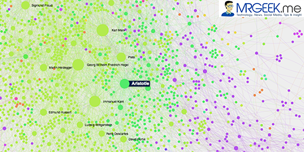
After seeing these graph visualizations, it becomes obvious to point out the most influential people in their respective communities, and the most influential people of all, as indicated by the node sizes in the graph. It is fair to say the most influential people cluster around a category of philosophers. Now, as we are using in-degree as a metric of influence measurement, the 5 most influential people are Marx, Hegel, Kant, Nietzsche and Aristotle. They are all philosophers, popular figures indeed, and very influential in the modern era, but is this really justified?
The graph view below is from a macro-perspective, highlighting major influencers.

Fig. 33
PageRank Analysis
An in-degree is a good indicator of the most influential person in a group, as shown in our graph analysis in the previous sections. But, is mere followership of a node (person) a truthful indication of social capital and influence in its entirety? Shouldn’t influencing someone influential count more then mere in-degrees towards a node?
We aim to answer this question through a PageRank analysis, by calculating the PageRank of each node in the graph and observing the results. PageRank algorithm assigns weightage to each node based on the quality of the incoming edges towards it rather than quantity. It is able to indicate internal authority of each node. This very property can reveal the influencers who influence other influencers.
We run the PageRank algorithm on each node with a damping factor of 0.85 and reveal the new set of influencers. This time, the node size will increase proportionally to the PageRank of each node rather than the in-degree, as done previously. The updated graph looks something like this, as shown below.

Fig. 34
With PageRank as a metric of influence, the graph’s face has been changed entirely, with Plato being the most influential person, and the Marx (highest influential per in-degree metric) is hardly even close. So, the question of answering whether Plato is more influential because he influenced another influential man called Aristotle is a puzzling one – and not alone answerable from graph analysis alone.
The data table reveals the 5 most influential people via PageRank to be Plato, Aristotle, Heraclitus, Homer and Parmenides. They are all the fathers of modern Western Philosophy, and polymaths. The puzzling question that surrounds this study is “how to really define influence” and naturally a very difficult one.
Finding Truth with PageRank
The in-degree metric revealed Aristotle to be greater influencer than Plato, but with PageRank metric, Plato tops Aristotle and everyone else as the most influential person in our graph. The question of ‘was Plato really more influential than Aristotle’ is a difficult one since both men were knowledgeable, powerful and highly influential during the course of history. To validate if PageRank analysis is truthful, we must segment other nodes of people from different professions to prove the proposition.

Fig. 35

Fig. 36
Let us look at the influence comparison of Charles Darwin (evolutionist) and Richard Pryor (comedian) through our earlier in-degree based influence ranking metric. Richard Pryor, a name completely unheard of, tops Charles Darwin by an in-degree ratio of 61(Pryor):38(Darwin); hence Pryor is more influential than Darwin. The puzzling thought is, is this really the truth? The images above-left show the size comparison of Pryor’s and Darwin’s node sizes respectively.
With PageRank

Fig. 37

Fig. 38
The images on the right show the node sizes of Darwin and Pryor, now with PageRank as a metric of influence ranking instead of in-degree. Darwin wins, with a PageRank of 0.004 as compared to Pryor’s 0.001. Yes, Darwin is definitely a lot more of an influential man in history as compared to Pryor. As hypothesized earlier, PageRank is a solid indicator of influence as compared of in-degree and this has just been proven as above.
5. Conclusion
In conclusion, the study has revealed very interesting results. For example, although in-degree is deduced to be as a good measure of social capital and influence in a group, PageRank gives a more meaningful result, reflecting a greater amount of truth than any other analyzed methodologies.
However, as with any network analysis study, the final conclusion can’t be based on a mere dataset of ~13,000 people, primarily from a source like Wikipedia, which is biased towards favoring the western culture. A more accurate representation of truth can only be obtained when the data is i.e. from a range of international encyclopedias and based on surveys/ different sources like secondary research.
However, regardless of the result, interesting conclusions with respect to measuring influence in a group using social network analysis have been studied, and the output is very eye opening. The truth in the data is reflected nonetheless to a great extent relative to the flavor and size of the data. A key discovery from this study is: ‘people, to a large extent, get influenced by, and influence, people belonging to their respective disciplines (areas, fields or professions)’.
However, we can conclude by saying that measuring influence is a challenging task, and quantitative measurements are alone not enlightening enough. We can ask ourselves again the puzzling question, ‘how do you really measure influence?” Sure, the wise answer would be, a blend of qualitative and quantitative analysis. But does social network analysis do justice to question posed at the beginning? Yes, definitely. It helps turn a chunk of numbers into meaningful insight and foster growth of new knowledge.
Visualize my work
As promised, you can visualize my research work by:
- Data Visualization Interactive Playground. Please let it load for 2 minutes. It’s 11 MB of data.
- A PDF version of the work, exported from a Gephi directly. Less fun. Pick the interactive.
6. References
[1] Lehmann, J. 2011. [online] Available at: http://jens-lehmann.org/files/2011/dbpedia_overview.pdf [Accessed: 8 Jan 2014]. [2] Grandjean, M. 2014. Introduction to Network Visualization with GEPHI. [online] Available at: http://www.martingrandjean.ch/introduction-to-network-visualization-gephi/ [Accessed: 9 Jan 2014]. [3] University, B. 2014. [online] Available at: http://www.cs.berkeley.edu/~vazirani/s99cs170/notes/lec12.pdf [Accessed: 10 Jan 2014].
About Ali Gajani
Hi. I am Ali Gajani. I started Mr. Geek in early 2012 as a result of my growing enthusiasm and passion for technology. I love sharing my knowledge and helping out the community by creating useful, engaging and compelling content. If you want to write for Mr. Geek, just PM me on my Facebook profile.