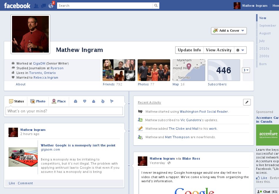
Introducing the new Facebook Timeline, now with a sleeker, fresh and redesigned layout. The new Timeline is a big leap from the previous version, which wasn’t well received by the general public, due to its messy layout for displaying wall content.
This time, Zuck & Co. have got things right. Here’s what the new Timeline has to offer.
Single Column for Wall Content
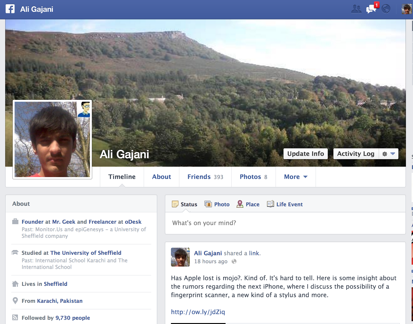
The new Facebook Timeline has a single column layout for displaying wall content. This is a great improvement from the previous version, which used dual columns and irked majority of the users. The single column layout for wall content allows you to easily skim through wall posts, photos, status updates and every thing that ever existed on your wall, almost in no time.
New Timeline Link Panel
The new timeline link panel is redesigned and looks much more neater. Facebook has taken a leaf out of Microsoft’s Metro UI here – large typography, flat design and padded boxes. It is a job well done.
Redesigned About Box
The About box has been redesigned. It is now left aligned and its location has changed too (previously under the cover photo). It looks minimalistic and yet expressive. However, one thing that doesn’t look good is the area for displaying the number of followers. Facebook needs to find a new way display this statistic, by giving it more prominence. Now, it just looks boring and dull. People who care about their clout on social networks would agree with this statement.
Other Minor Changes
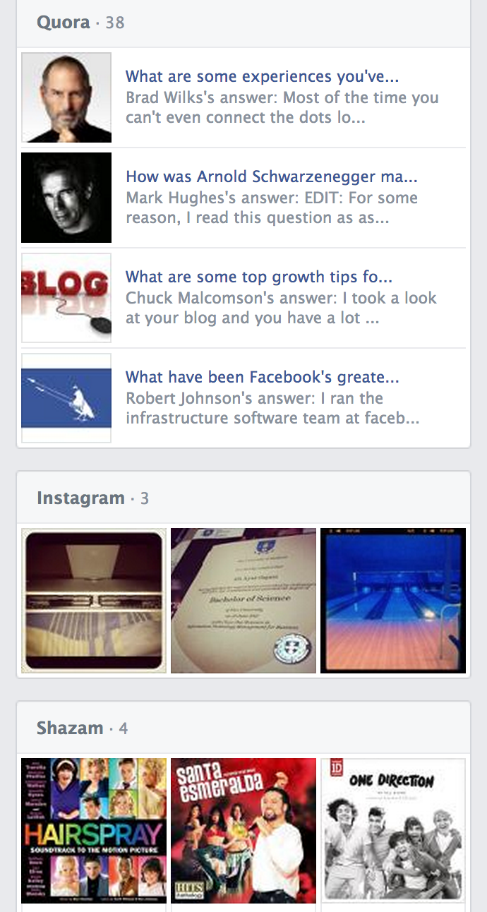
The two other minor changes in the new Facebook timeline are a) sidebar for pinning your favorite content and b) a place for showing content aggregated from a variety of Facebook social apps, like Quora etc.
About Ali Gajani
Hi. I am Ali Gajani. I started Mr. Geek in early 2012 as a result of my growing enthusiasm and passion for technology. I love sharing my knowledge and helping out the community by creating useful, engaging and compelling content. If you want to write for Mr. Geek, just PM me on my Facebook profile.


