The super popular web design toolkit Twitter Bootstrap is already here. Even though the two designers aren’t working at Twitter anymore, I am sure it’s still going to be referred to as Twitter Bootstrap. But you can call it Bootstrap too. So the latest version, as of now, is 2.2.1, released on 30th of October 2012. If you follow Mr. Geek, you might know I authored a tutorial on Bootstrap. Even though it is based off an older version, you can still have a look at it here if you are beginning to dive into the Bootstrap world.
Bootstrap is available here. So lets dive into Bootstrap 2.2.1 and test out the major new features.
Four New Templates: You must have used the starting point templates Bootstrap comes packaged with. Now, with 2.2.1, you have four new templates to get your project up and running in no time. They are the narrow marketing template, the sign in template, the sticky footer (I know you’re curious about this one) and the carousel template. First, let’s have a look at these four new templates before we move on and talk about something really important.
Now that you have seen the gallery of the new Bootstrap 2.2.1 templates, let’s talk about the Sticky Footer. I have participated in the GitHub discussions on the Bootstrap repository and I am glad to tell you, those discussions amongst us design geeks have finally paid off. The sticky footer solution was long a missing link in Bootstrap, with the original engineers giving out a few hints here and there and they didn’t work all the time. I am really happy the latest release of Bootstrap 2.2.1 has a template dedicated to show clearly how to achieve a sticky footer without breaking things. Here are a few lines of code to see how a sticky footer can be achieved in Bootstrap 2.2.1 (or for that matter older versions)
Achieving a Sticky Footer
If you are using an MVC framework like CodeIgniter, it is suggested to add this block of code into your header.php file where you should be able to load it every time you render your web page. This block of code is essentially the recipe for achieving a sticky footer. It basically does what it’s supposed to do, make that irritating footer stay at the bottom!
The CSS
1 2 3 4 5 6 7 8 9 10 11 12 13 14 15 16 17 18 19 20 21 22 23 24 25 26 27 28 29 30 31 32 33 | html, body { height: 100%; /* The html and body elements cannot have any padding or margin. */ } /* Wrapper for page content to push down footer */ #wrap { min-height: 100%; height: auto !important; height: 100%; /* Negative indent footer by it's height */ margin: 0 auto -60px; } /* Set the fixed height of the footer here */ #push, #footer { height: 60px; } #footer { background-color: #f5f5f5; } /* Lastly, apply responsive CSS fixes as necessary */ @media (max-width: 767px) { #footer { margin-left: -20px; margin-right: -20px; padding-left: 20px; padding-right: 20px; } } |
The HTML
1 2 3 4 5 6 7 8 9 10 11 12 13 14 15 16 17 18 19 | <!-- Part 1: Wrap all page content here -->
<div id="wrap">
<!-- Begin page content -->
<div class="container">
<div class="page-header">
<h1>Sticky footer</h1>
</div>
<p class="lead">Pin a fixed-height footer to the bottom of the viewport in desktop browsers with this custom HTML and CSS.</p>
</div>
<div id="push"></div>
</div>
<div id="footer">
<div class="container">
<p class="muted credit"> Footer Text </p>
</div>
</div> |
And you’re done. You have your working new Bootstrap 2.2.1 sticky footer.
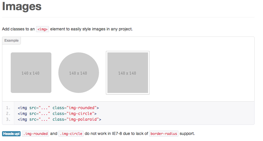
Images: Earlier, you could only use square styling for images. Now with this latest version, you can apply square, circle and rounded border styles to images. Even though its a small addition, its still something to look out for as these small changes can impact your design process greatly. Here is a little snapshot.
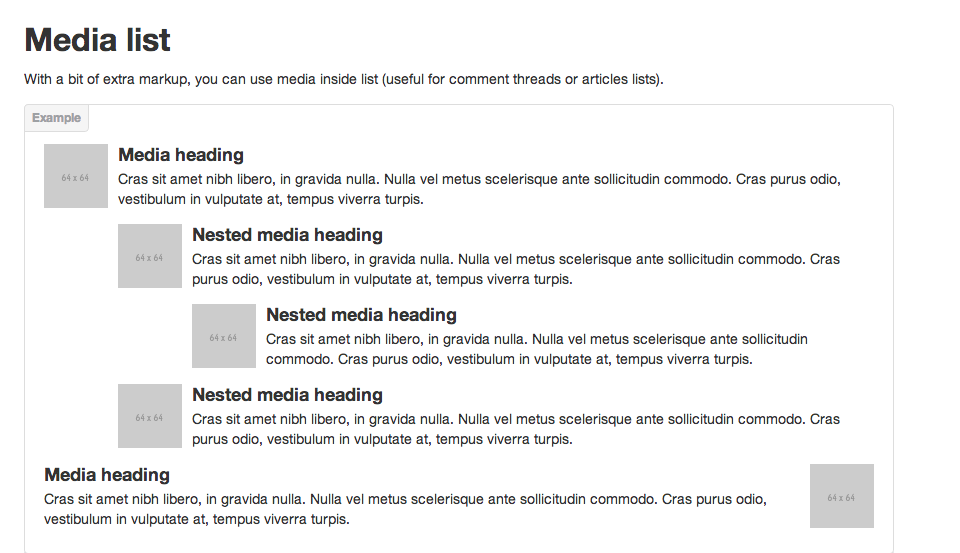
Media List: Bootstrap 2.2.1 now has a Media List functionality. This is a new addition to the framework, allowing you to create features like Tweets, Comments or other nested threads e.g. comment lists. So for example, if you were to create your own commenting system, the Media List objects of Bootstrap 2.2.1 would be of great use. I can’t think of any other uses of the media list but I am sure there are a myriad of ways you can utilize them.
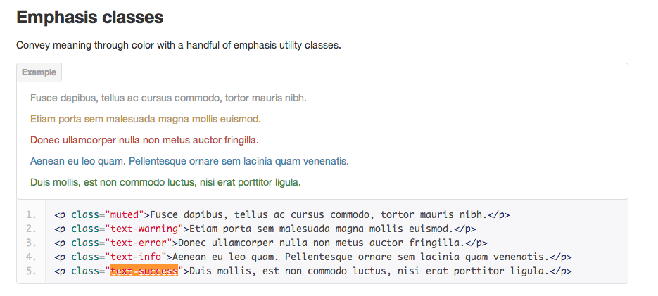
Emphasis Classes: This is not a big addition but its pretty useful. You now have standardised emphasis classes, which enable you to turn any <h1>, <p> or <span> tag into a color you want. The “muted” class is the one that caught my attention. It basically allows you to turn any normal text (which is black) into light grey. This has been utilised in many places across the Bootstrap documentation, as you may find here.
Overall, the new Bootstrap 2.2.1 is a great update to an already great web design toolkit by ex-Twitter engineers. I have been overwhelmed at the great response I got from my earlier Bootstrap tutorial. Thank you. Also, I take this opportunity to tell you that please feel free to ask me any related questions in the comments section below and I will do my best to answer you. Don’t forget to subscribe Mr. Geek on Facebook and look out for other Bootstrap related stuff.
About Ali Gajani
Hi. I am Ali Gajani. I started Mr. Geek in early 2012 as a result of my growing enthusiasm and passion for technology. I love sharing my knowledge and helping out the community by creating useful, engaging and compelling content. If you want to write for Mr. Geek, just PM me on my Facebook profile.


