


The CSS3 border-radius property allows web designers to define the roundness of an element. The property is so powerful that it has replaced the use of images, which make your website heavy and pixelated.
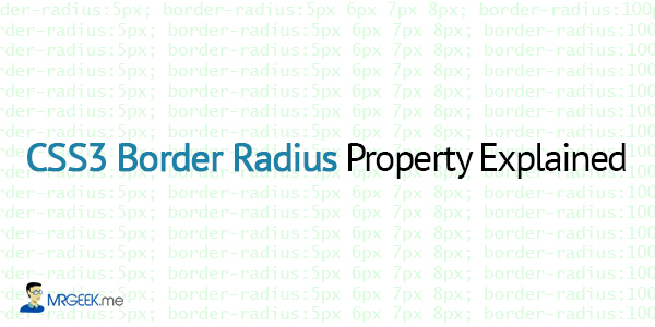
Many web designers understand the basic syntax for using the border-radius property in CSS3, but there’s more to it than just border-radius:5px. Today, we will dive deeper into the mysteries of the border-radius property with a detailed explanation of what can it achieve. Without further ado, let’s get started.
Compatibility: The border-radius property is supported in IE9+, Firefox 4+, Chrome, Safari 5+, and Opera.
Different Syntaxes of Border Radius
Basic Syntax
The common use of the border-radius property is as shown below. With this syntax, all four corners become equally rounded.
border-radius:5px;
Specific Corner
To be able to control the radii of each of the four corners, you need to use the following syntax.
border-radius:5px 6px 7px 8px;
The four values for each radii are given in the order top-left, top-right, bottom-right, bottom-left.
The diagram below illustrates these two syntaxes.

More Precision with 8 values
Think that was it? Nope, there’s more the border-radius property in CSS3 could achieve. How about being able to control the vertical and horizontal radii of each of the four corners? Yep, it is possible, as one border-radius syntax allows you to input 8 different values to obtain maximum precision over the roundness of your element.
Here is another diagram to help you visualise this concept better.
border-radius:108px 108px 108px 94px/128px 128px 128px 128px;
The CSS code above produces the box on the left (in blue). The diagram on the right shows how this complex syntax really works.

Playing Around
It takes some practice to get the border-radius syntax in your head (the last one is complex). Let’s play around to see some cool results.

The image on your left shows a live render (in a browser) of two shapes utilizing the CSS3 property border-radius, with a single variation, in A and E (refer to the previous diagram).
At first, 100 extra pixels are added to E, causing a vertical radius variation in the top left corner of the shape.
Then, 100 extra pixels are removed from E and added to A, causing a horizontal radius variation in the top left corner of the shape.
Therefore, these two shapes demonstrate the power of the border-radius property in CSS3, allowing you to control the radii with precision and detail.
The Code
Here is the code.
<!DOCTYPE html>
<html>
<head>
<style type="text/css">
.shape {
 border-radius:108px 108px 108px 94px/228px 128px 128px 128px;
 height:128px;
 top:47px;
 width:108px;
 border:2px solid black;
 background:#08c;
}

.shape2 {
 border-radius:208px 108px 108px 94px/128px 128px 128px 128px;
 height:128px;
 top:-47px;
 width:108px;
 border:2px solid grey;
 background:tomato;
}

p {
 margin-left:30px;
 margin-top:55px;
 color:white;
}

span {
 margin-left:30px;
}
</style>
</head>
<body>
<span>Vertical</span>
<div class="shape"><p>Shape 1</p></div>
<br>
<span>Horizontal</span>
<div class="shape2"><p>Shape 2</p></div>
</body>
</html>
Next Up
In a future article, we will look at creating logos with the border radius. Till then, good bye.
About Ali Gajani
Hi. I am Ali Gajani. I started Mr. Geek in early 2012 as a result of my growing enthusiasm and passion for technology. I love sharing my knowledge and helping out the community by creating useful, engaging and compelling content. If you want to write for Mr. Geek, just PM me on my Facebook profile.