


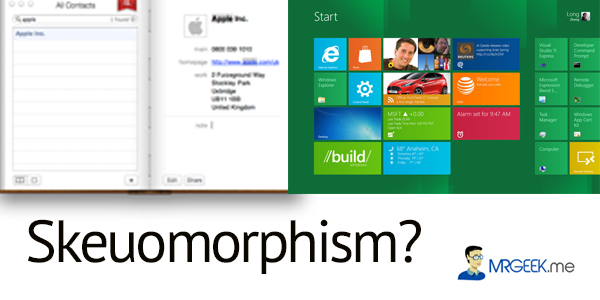
Skeuomorphism is a concept that involves the use of real world design in a digital context. Some popular examples of applications that incorporate skeuomorphism into their user interface (UI) are “iBook”, “Notes” and “Find My Friend”.

Skeuomorphism is at the core of Apple’s design philosophy. Steve Jobs was perhaps the biggest proponent of skeuomorphic design. He believed that skeuomorphism acted as a bridge between the physical world and digital abstractions. The iOS is a great example of skeuomorphism, with highly textured skins, heavy design and elaborate themes.
Is Skeuomorphism boring?
But is skeuomorphism still relevant today, or is it getting old? I believe that Apple’s design philosophy of skeumorphism is becoming boring, outdated, and bereft of innovation. Chief Industrial Designer at Apple, Sir Johnny Ive thinks same. He said “I have a distaste for the visual ornamentation in Apple’s mobile software known within the company”. Ive expects to move the company toward a less skeuomorphic aesthetic after the departure of Scott Forstall in 2012. Scott was largely responsible for the skeuomorphism in iOS.
Brief History
So why isn’t skeuomorphism relevant anymore? Before I start giving out my reasons to support the argument, I want to go back a little into history. Before the iPhone, realism in user interface was unusual, with the exception of video games. But on a more serious note, realism was still very limited.
Steve Jobs’ obsessions with realism was a proof of his love for real-world materials (Fast Company reported that iCal’s leather stitching is based on Jobs’ own private jet’s chairs). This can be proven by looking at the earlier versions of Mac OS X, where we see Apple using Glass buttons on their user interface.

But with iOS, Apple began to embrace realism even more, which today is known as the skeuomorphism design philosophy. I am not saying Steve Jobs was wrong or that realism in software design is bad. Sure who doesn’t love page turn animations and leather textures, so what’s the problem, you might wonder?
The Problem
The problem is the rise of flat design, with the most common example being Microsoft’s Metro. The rise of the flat design makes skeuomorphism a thing of the past and less relevant. I am not against the realism in skeuomorphism, but my concern is more about it’s relevance today. So what is flat design? Here’s an example.

This is the Metro as seen in Microsoft’s Window 8 operating system. Metro, or Metro Design Philosophy, offers flat squares with large typography. You can trace back the roots of Metro in Swiss design, but it is Microsoft who has popularized it in recent times. Metro has received a great reception from the design community and users in general, who welcomed its use of strong typography and colors.
In essence, Metro embodies minimalist design, something that is becoming the trend today. You won’t see a lot of apps using textures these days, of course with the exception of Apple.
Towards a new phase
The move away from skeuomorphism towards Metro is happening right now. The Metro design philosophy is taking over and skeuomorphism is slowly becoming a thing of the past. Why? The answer is responsive web design (a single design that adapts to multiple screen sizes). As we move into the mobile age, responsive web design is becoming more and more relevant with time. Metro thus facilitates the creation of beautiful responsive web designs where as skeuomorphism appears to be less flexible and rigid.
In addition, designers love Metro for its ability to create responsive applications that work on multiple screen resolutions. Skeuomorphism involves lots of realism, like textures, which means creating newer designs for different screen resolution becomes a tiring process, consuming more time in the design cycle.
The influence of responsive web design and its increasing popularity has pushed more designers to adapt the Metro design philosophy instead of skeuomorphism. This in turn has created a ripple affect, and is seen in many forms like websites and apps (BBC, Mashable, Mr. Geek and Clear App).
Conclusion
It is important to realize that visual styles like Apple’s skeuomorphism and Microsoft’s Metro are just tools, not goals in themselves. However, I would rather put my chips in Metro because it is modern, flexible and minimalistic. Metro clearly involves caring more about typography and layout, and in the age of content, typography is one key element.
Besides this, Metro allows you to create gorgeous mobile apps, facilitating greater focus on interaction design and animation. If you are a designer, I highly recommend you to embrace Metro, not as an aesthetic choice, but as a design exercise to create better products for the technology of today.
About Ali Gajani
Hi. I am Ali Gajani. I started Mr. Geek in early 2012 as a result of my growing enthusiasm and passion for technology. I love sharing my knowledge and helping out the community by creating useful, engaging and compelling content. If you want to write for Mr. Geek, just PM me on my Facebook profile.

Pingback: Skeuomorphism : an online issue | Marketing Mantra()
Pingback: Skeuomorphism : an online issue | Marketing Mantra()